

The Push: July 13th, 2026
Tasteful AI webpages, agent-proof command rails, and Windows cleanup that finally sticks

Hallmark: AI Design Needs Better Taste
github.com/Nutlope/hallmark | License: MIT
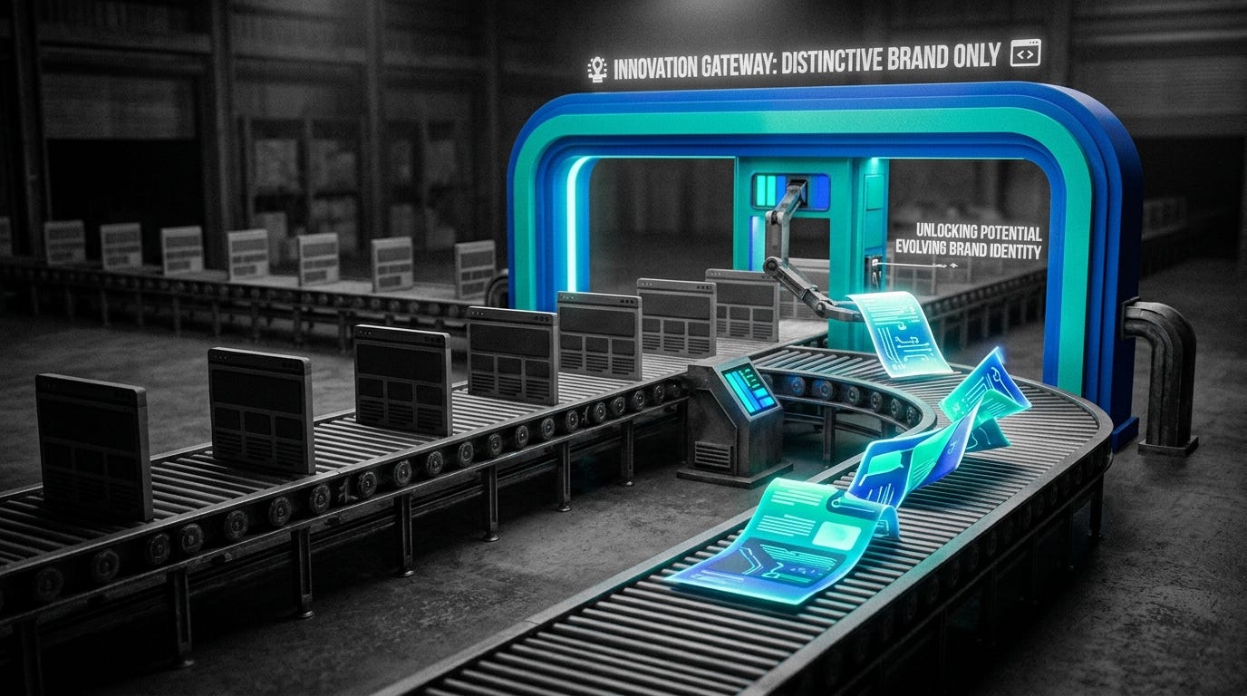
Open any AI site generator long enough and the pattern starts shouting at you. Rounded gradient blob, centered headline, soft testimonial cards, maybe a polite code block if the brief smells technical. The output works, technically. It also feels like every other landing page on the internet. Hallmark goes straight at that fatigue. Instead of trying to make AI design faster, it tries to make AI design less embarrassing, which is honestly the more interesting problem once speed is already cheap.
The Drop: Fighting the Same Site Over and Over
Plenty of AI coding tools can ship a webpage from a prompt. That is no longer impressive. The frustration starts one layer higher, when every generated page feels trapped inside the same aesthetic distribution the models were trained on. Different brands, same structure. Different copy, same hero. Different market, same visual rhythm. You can almost spot the synthetic fingerprints before the page finishes loading.
Hallmark exists because that sameness is becoming a real product problem. Founders want a launch page that feels branded. Agencies want fast concepts without delivering obvious machine output. Even internal teams prototyping ideas need something that doesn’t scream “generated draft” in the first five seconds.
Nutlope frames this as anti-slop, and that label fits. The repo is built for Claude Code, Cursor, and Codex, but the target is broader: stop AI from collapsing every brief into polished mush. Hallmark’s promise is simple and pretty bold: two pages created from two different prompts should actually look like two different designers made them, not like the same template got recolored.
The Stack: Rules Over Widgets
Under the hood, Hallmark is mostly CSS plus structured prompt rules, reference docs, and a portable SKILL.md package that plugs into Claude Code, Cursor, and Codex. The output is plain HTML, CSS, and light JavaScript, which matters because the system is optimizing for design character, not framework cleverness or runtime complexity.
The Sauce: A Taste Engine, Not a Template Library
Here’s where Hallmark gets genuinely smart: the repo treats design generation as a constrained editorial system, not a component assembly job. The core unit is macrostructure, a high-level page shape chosen for the brief before styling starts. That means layout logic comes first, which is why outputs can diverge in more meaningful ways than color palettes and font swaps.
Then Hallmark layers in themes, a catalog of twenty visual directions that govern type pairing, spacing behavior, palette anchors, and motion style. But the notable part is not the theme count. The notable part is the refusal to let themes become templates. A sourdough app, a developer API, and a record label should not share the same skeleton, and Hallmark encodes that judgment directly into the generation flow.
The other key mechanism is the slop-test gates, fifty-seven checks plus a pre-emit self-critique that screen for overused AI patterns before the page is returned. That is closer to a quality firewall than a prompt trick. Instead of asking the model to be tasteful in one shot, Hallmark wraps generation in a review process that penalizes obvious defaults, repetitive structure, and generic polish. That is the architectural bet.
There’s also a quiet escape hatch called Custom, which activates when a brief carries enough creative intent that no catalog theme fits. That matters because rigid systems usually break at the exact moment the brief gets interesting. Hallmark seems to know that taste cannot be fully enumerated, only guided.
The Move: From Faster Mockups to Better Signals
Start with a real use case, not a toy prompt. Feed Hallmark the launch brief for a new product page, a microsite for an event, or a brand refresh concept that needs visual options fast. The useful move is not replacing a designer wholesale. The useful move is generating distinct directions that feel intentional enough to react to, critique, and narrow.
Hallmark also ships four practical verbs, and that gives the repo more strategic range than a one-click generator. Audit scores an existing page against anti-patterns, which is perfect for teams whose current site already has the “AI-made” smell. Redesign keeps copy, information architecture, and brand while rebuilding the visual fingerprint. Study extracts DNA, Hallmark’s shorthand for reusable design traits like macrostructure, type pairing, and color anchor, from a screenshot or URL without drifting into clone mode.
That combination creates a workflow advantage. A startup can test multiple branded directions before hiring an agency. A design team can benchmark whether generated work is converging into mush. An operator shipping pages every week can build a house style that stays varied without becoming random. In other words, Hallmark is less about making pixels and more about improving taste throughput.
The Aura: Taste Stops Being So Scarce
Creative confidence changes when the blank page stops fighting back. Not because software replaces judgment, but because more people can enter the conversation with outputs that already have texture, stance, and enough specificity to debate. That lowers the social cost of making something weird.
Hallmark points at a bigger expectation shift too. If AI is going to generate interfaces everywhere, people will stop tolerating generic beauty as a sign of competence. They’ll want software that shows discernment. Not just working pages, but pages with point of view.
The Play: Taste as Workflow Infrastructure
This looks less like a 0-to-1 market creation and more like a sharp wedge into the exploding AI-assisted design workflow TAM. The opportunity is real because PMF is showing up in the repo itself: nearly 5,000 stars in a short window, strong visual demos, and a concept that spreads well on social feeds because the before-and-after is immediately legible. The moat is not data, at least not yet. The moat is execution speed plus opinionated rules that create switching costs through habit formation. Once a team trusts Hallmark as its anti-slop layer, ripping that out means risking brand sameness again.
Winners:
Lovable: Better front-end generation compounds if teams can pipe outputs through a recognizable taste layer instead of shipping the same polished SaaS shell every time.
Webflow: More AI-assisted site creation increases demand for platforms where generated concepts can be refined, productionized, and handed to marketers without code debt.
Adobe: Brand-sensitive generative workflows get stickier when taste controls become expected, which strengthens Creative Cloud’s position as the system of record for final visual judgment.
Losers:
Gamma: Generic AI-generated presentation and page aesthetics erode faster when users can plainly compare “clean” output with output that actually has visual identity.
Framer: Template-adjacent website creation gets pressured if anti-slop systems make raw generation feel less repetitive and therefore less dependent on pre-baked design patterns.
Wix: Mass-market site builders lose some differentiation when external AI layers can produce more distinctive first drafts with lower CAC and increasingly acceptable quality.
tl;dr
Hallmark turns AI site generation into a taste-governed system instead of a template roulette wheel. The clever part is the combo of macrostructure selection, anti-slop review gates, and a custom branch for briefs that need real creative deviation. Founders, marketers, and design teams shipping branded pages should look closely.
Stars: 4,920 | Language: CSS
